Biostar TPower i55 – Super Middle Weight Contender
by Rajinder Gill on November 25, 2009 12:00 PM EST- Posted in
- Motherboards
3D Rendering-
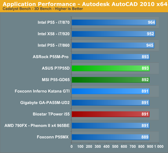
AutoCAD 2009 x64
We utilize AutoCAD 2010 x64 and the Cadalyst Labs 5 benchmark.
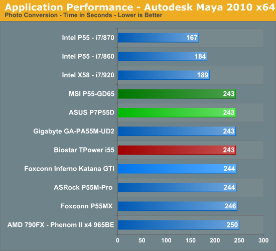
3ds Max 2010 x64
We utilize a rather large mental ray image and track the time it takes to render it.
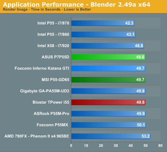
Blender 2.49a x64
We utilize the flying squirrel benchmark image and track the time it takes to render it.
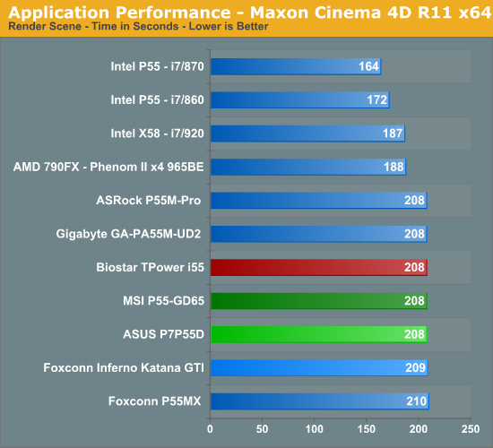
Cinema 4D R11 x64
Cinema 4D R11 is one of our favorite programs to create high-end 3D images and animations. We track the time it takes to render a swimming pool layout.
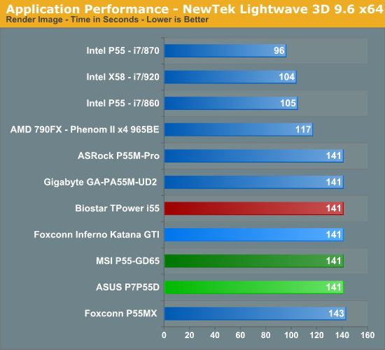
LightWave 3D 9.6 x64
Another popular 3D rendering program is Lightwave 3D 9.6. In this test we time the rendering of a single frame from an office building animation. The time to render the full scene is approximately four and a half hours.


39 Comments
View All Comments
treesloth - Monday, December 7, 2009 - link
I first used the internet when the main protocol was IP over smoke signals, so keep your fancy "flexibility" off my lawn!Seriously, though, good points. I also have to compliment Anandtech on basing their article layouts on visitor convenience, as opposed to the many sites that seem to try to herd as many visitors as possible into as many page views (and ad impressions) as possible.
Rajinder Gill - Thursday, November 26, 2009 - link
Yes, the summary/conclusion is on the first page. For the exact reason that Bull Dog mentions. We've had a lot of requests from people that want 'bare all' on the first page, so here it is. Saves you having to trundle through every page picking up tidbits here and there of what the board can or cannot do. We know it won't appease everybody, but then appeasing everybody is impossible anyway..lolregards
Raja
poohbear - Thursday, November 26, 2009 - link
I think it doesnt make sense. who says u hafta "trundle" through every page to get to the conclusion?? u just click the drop down menu & go to the conclusion. A site for computer enthusiasts & the readers can't even figure out how to use a drop down menu????Devo2007 - Thursday, November 26, 2009 - link
I agree - the new layout is confusing.What I'd suggest is a small summary of the article (either Pros/Cons, or small highlights of the product being reviewed. That way, people can get a quick overview of the product, and delve into the article more if they wish.
Putting the full-fledged conclusion on the main page just doesn't seem to fit right.
Rajinder Gill - Thursday, November 26, 2009 - link
I'll try and find a happy medium that does not confuse people too much..loltreesloth - Monday, December 7, 2009 - link
Put the conclusion right in the middle-- page 10 of a 20-page review. Oh, and since programming languages can't seem to settle whether indexing should start at 0 or 1, we'll compromise and start at .5.Seriously, though, I think people will get a little confused exactly once, figure it out, and never have another problem. I like the new way.
sonci - Thursday, November 26, 2009 - link
Its called abstract,its used on medical articles..
Rajinder Gill - Thursday, November 26, 2009 - link
Whichever way you look at it; you click on the review, read the first page for everything relevant and then if it interets you to lo at the figures, read on. Can't get much simpler than that.later
Raja
Bull Dog - Wednesday, November 25, 2009 - link
First/second page conclusion.Kinda wierd but I like it over the standard "go through 11 gazillion pages of nearly meaningless numbers."